Not sure if we think this is the right look, but we need to start thinking what we want the coridoor going into the basement to look like. This is one idea:
Thursday, 28 November 2013
Tuesday, 26 November 2013
Music (Research)
One of my group members found some more music that we thought might work. This is the link to the music (it's the 3rd one down): http://www.freesfx.co.uk/sfx/scary
The only problem with this music is that it's too short for the length we need our opening sequence to be.
The only problem with this music is that it's too short for the length we need our opening sequence to be.
Monday, 25 November 2013
Looking at flashbacks (Research)
GROUP RESEARCH:
In our opening sequence we don't know whether to create two stories of the man, him in the room with the child, and also him with his wife who is actually dead. The use of flashbacks in Band of Brothers makes it clear that he is thinking about something else (the flashbacks) which is what we could do. This is just a possibility/idea.
In our opening sequence we don't know whether to create two stories of the man, him in the room with the child, and also him with his wife who is actually dead. The use of flashbacks in Band of Brothers makes it clear that he is thinking about something else (the flashbacks) which is what we could do. This is just a possibility/idea.
Friday, 22 November 2013
Setting/Lighting for our opening sequence (Research)
We want to recreate the feel of a loft in the top of a house. I started to think of films that used similar settings and props that we want to use for our title sequence and I thought of the film 'Disturbia'. The film is based in a 'Crafts-man' style house. This type of house has a pointed roof so the loft at the top would look good as it would feel quite isolated and secretive.

I then looked at one of the previous student's work a few years back and how they recreated the space of a loft in the studio at my college. This is the music video:
The scenes of where the woman is in the darker, closed in space is the feel we wanted to create. As was done before, we know it is achievable; it was simply created by leaning two wooden planks against one-another to create the triangle roof shape which makes it look like a closed-in loft.
This is now one very possible idea for the look of our 'loft'.
I then started to look at the props and things within the scene for our opening sequence. We simply want the props: a camera, a tripod, a laptop, a phone and then a few folders/pens etc, but that's the basic props we need to include. We realised when doing our first draft for our storyboard that the timings of it wasn't long enough so we started to think of things we could include, which revolved around introducing more props such as the folders etc, but we don't want to just add in pointless things to add extra time as otherwise it's meaningless.
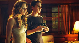
I looked at the film 'Disturbia' again and looked at the details within the boy's bedroom where he has his camera and stuff set up and started taking ideas from this setting. These are some of the images I found:


I then looked at one of the previous student's work a few years back and how they recreated the space of a loft in the studio at my college. This is the music video:
The scenes of where the woman is in the darker, closed in space is the feel we wanted to create. As was done before, we know it is achievable; it was simply created by leaning two wooden planks against one-another to create the triangle roof shape which makes it look like a closed-in loft.
This is now one very possible idea for the look of our 'loft'.
I then started to look at the props and things within the scene for our opening sequence. We simply want the props: a camera, a tripod, a laptop, a phone and then a few folders/pens etc, but that's the basic props we need to include. We realised when doing our first draft for our storyboard that the timings of it wasn't long enough so we started to think of things we could include, which revolved around introducing more props such as the folders etc, but we don't want to just add in pointless things to add extra time as otherwise it's meaningless.
I looked at the film 'Disturbia' again and looked at the details within the boy's bedroom where he has his camera and stuff set up and started taking ideas from this setting. These are some of the images I found:


I like the idea of the look of this setting as it looks very set-up and secretive and has a lot of technical gadgets which we could use for the look of our setting, however as the 'Camera man' in our story has an OCD we can't make it look too messy, however we want our audience to get the idea that he has been watching this girl for a while. I like the look of the brown/dark colours and the TV's set up to the camera's as it looks really technical and busy. I also like the look of the crowded space which is being created by all the CD's and rubbish and bed/chairs taking up the room - it makes it feel like things are going on but at the same time it's his home and it's his space. It also creates that feeling that he's been there for a while and is like waiting for something.
The blinds are a really nice look as they feel like the room is being hidden away and because they're lined blinds (they're like bars) it feels really like trapped and it could make our character, if we used the blinds, look really anti-social and unknown/lonely which makes us think/the audience think he's a bit odd and creepy. The light behind the blinds and curtains creates a very darkened/yellow look which makes it look more sinister.
Another thing my group discussed was lighting. At first we had this idea that it would be a single spotlight set up in the studio, just showing a profile of the room - nothing to exciting. We never see the characters face so we didn't know whether the spotlight would work well as it might highlight him more. Plus, of course we want to find out who this man is, but really in the opening sequence we want the audience to be indulged in what he's doing and what the space around him is for and because the space is used for a weird, creepy obsession we want to light this more darker and creepier.
Once looking through the photos of the film 'Disturbia', the lighting in it is darkened but natural. It allows us to highlight things within the room but at the same time not giving too much away. The lighting in 'Disturbia' works nicely as it looks quite shadowy and the light does look homely but at the same time kind of creepy. We then started to come up with the ideas that we could have perhaps a lamp or a light hanging from the top to create some more natural lighting but not too much light that it gives the character away. The yellowy lighting of the lamp in the third picture in 'Disturbia' looks quite sickly but natural and I think that really suits the atmosphere that's going on in the beginning of our opening sequence.
Music for Opening Sequence (Research)
CHRIS'S MUSIC RESEARCH:
Research of music for Thriller idea.
This was my first thought; it is quite a sad tune but I thought it was more sinister than it actually was. This seems quite romantic which does fit with the flashbacks but will conjure completely different connotations of what the sequence is about and does not fit with the thriller genre.
This is the third song I found. It is slightly faster and more techno but is still somewhat sinister. The fluency fits our fast paced, quick shooting style. This, I think is almost perfect for the piece and will definitely direct the audience towards thinking this is sinister. It is a bit same-y however so I cannot deem this sort of music perfect.
These are just some ideas that I think could compliment the piece very well and aid fluency as well as building tension. I will take the ideas to the group and see how they feel about them.
Research of music for Thriller idea.
I have looked for sinister music to try to incorporate into our piece as non-diegetic sound. I looked broadly at some piano music as I feel this will fit into the sequence and allow it to flow seamlessly. These are some possibilities I have found.
This was my first thought; it is quite a sad tune but I thought it was more sinister than it actually was. This seems quite romantic which does fit with the flashbacks but will conjure completely different connotations of what the sequence is about and does not fit with the thriller genre.
This is the third song I found. It is slightly faster and more techno but is still somewhat sinister. The fluency fits our fast paced, quick shooting style. This, I think is almost perfect for the piece and will definitely direct the audience towards thinking this is sinister. It is a bit same-y however so I cannot deem this sort of music perfect.
These are just some ideas that I think could compliment the piece very well and aid fluency as well as building tension. I will take the ideas to the group and see how they feel about them.
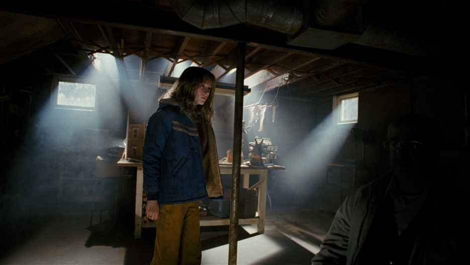
'The Lovely Bones' basement scene (Research)
Again, this is just an idea. It has a lot of un-needed props in this scene, but the lighting in this scene is good and could perhaps suit our opening sequence for the basement.
Sound Effects (Research)
In the beginning of our opening, as we do not show the 'camera man', we need something to make sure we know we're following him. We want the opening to start on his feet, walking to the basement. To add some isolated/taunting feeling, we wanted to add some footsteps and creaky floor-board sound effects. This is some ideas we found.
Se7en Music (Research)
We liked the soundtrack to the opening of 'Seven'. It creates a weird atmosphere - it doesn't really tell you a lot and it sounds so odd and creepy that we don't really know what's going on. This music sets a particular mood but at the same time doesn't lead up to giving too much away. I think this type of sound would really support our opening.
'The Rock' film (Research)
This is a thriller one of my group members found. We like the setting/lighting in the part of the trailer where the man is being interrogated (44 seconds - 50 seconds & 1 minute 14 seconds - 1 minute 22 seconds).
The feel of these parts look as if it could be a basement. The lighting has blue-y colours and it looks cold and dark; we also liked it as it did feel very isolated and hidden.
Lighting (Research)
My group started to look at lighting ideas. We originally looked at single spotlights and different lighting positions. We then started to talk about wanting to have the lighting dimmed so that it is darker and more mysterious; for example, just having a single light bulb in the room, giving it that more naturalistic lighting, but the room still looking dimmed - just like in the title sequence 'Affliction'.


'Affliciton' title sequence (Research)
This is a thriller from previous years - we liked the look/setting in this opening sequence.
Thursday, 21 November 2013
Plot/Synopsis - change within direction/story
With the research we had done about the 'loft' idea and the house design etc. previously, we actually started to question how we were going to film this girl if the idea was that the loft was to be blacked out and that he was meant to be filming her next door without being caught, even though he lived next to the house. We were also concerned that we were going into 'cliché' territory.
We spent one lesson on just mapping our actual story out and how we could suit the location and make more sense of it. We detailed our story a bit. To clarify, our story idea is:
The 'camera man' is working within a police force. In previous years, he was married to a woman. He had to take a shift one night and asked his friend to pop in and see her as she wasn't well; he never came to see her. That night the house set on fire accidently and the wife died in it. The friend of the 'camera man' was too ashamed to confront his friend in saying that he never came to her and never got in touch with him again - eventually moving away and starting a family. Years later, the 'camera man' finally finds his friend and takes his young daughter captive, threatening him and wishing for him to experience his pain.
The opening sequence still involves the 'camera man' setting up his camera and equipment but instead of setting it up to film this young girl across the road, he is setting it up to film her in his basement as he kidnaps her, so he can send it off to the dad and threaten him.


Thursday, 14 November 2013
Kyle Cooper - 'Spider-Man' title sequence
'Spider-Man' being such a well-known superhero, being made into a film had to be so well captured. The opening to the film is brilliant. What I like most is the movement: Cooper has specifically designed the title sequence to bring the audience on a journey. We get a real sense of movement and travelling (one of Cooper's well known elements) and it really sets a quick pace as if it's like a race.
The colours look so slick, and the shapes and lines create the 'webbed' look, and this obviously relates very nicely. The title sequence looks really clean and slick. A lot of the titles look 3-D and we're taken around them and they're pulled apart to keep the audience interested in what new ideas are going to be brought in next. I think this sequence keeps an audience watching and it really does set up like an epic adventure. The use of colours obviously represent spider-man; they're deep and royal colours which makes the sequence look sharp.
Making the web feel 3-D is really clever as we feel like we're going through it and circling it all the time. The 'spider webs' always look really lean, thin and shiny so Cooper captures nicely the look of it - it actually makes it look really delicate.
Overall, I really like this title sequence. It captures a really essence of the up-coming story and actually helps the audience build up to what is going to happen as the sequence tells a story itself and helps take us on a journey.
Kyle Cooper - 'Twister' title sequence

This film is quite old, is one of Cooper's older title sequences made back in 1996. I chose this sequence to analyse because Cooper designed it with RGA (the original company he started off at).
Cooper’s design for this title sequence creates a very visual, moving, chunky, three-dimensional look for 'Twister' which exploits it's mid-nineties CGI to manipulate the letters as they materialize in the eye of the storm, disappearing all at once from the screen, in a dark’n’stormy flourish of meteorological drama. This piece of work truly shows elements of Cooper's work as he does like to peal away things for the screen make the move and twist and collapse.
I think the title sequence is really effective; it gives an iscolated feel with the colours and the idea that the letters are being pulled apart as if in a storm. I think it gives the opening a clear insight and also helps set up the film really well.
For a title sequence being made, going back 8 years... I think it was really cleverly done and it really does showcase some of Cooper's talents.
The title sequence for 'Twister': Twister title sequence - Watch the Titles
Kyle Cooper - 'Wimbledon' title sequence
Cooper made a title sequence for this film - it was made in 2004 and is classed as a 'romantic comedy'. Kyle Cooper is definitely not renowned for this title sequence as not a lot really happens. It doesn't really compare with a lot of his other really successful work such as the film 'Seven', and not a lot of people talked about it afterwards, however, it is still very clever and entertaining. It's so well executed making it eye-catching and interesting. I personally did like the sequence, but again wasn't so impressed as I was with his other work. I think it being a 'romantic comedy' film perhaps restricted him from using all his usual elements that he includes in a lot of his action packed/horror title sequences, so it's quite nice to see how he interpreted a different genre of film.
I think Cooper has successfully recreated and set the right atmosphere to start the film with - it also looks quite comical so it's already setting up some themes to the movie. It's very clever with timings and capturing reactions which sets off the movie well and the piece feels quite rhythmic; it certainly doesn't you make you feel uncomfortable, or make you feel to much is going on.
I think Cooper has successfully recreated and set the right atmosphere to start the film with - it also looks quite comical so it's already setting up some themes to the movie. It's very clever with timings and capturing reactions which sets off the movie well and the piece feels quite rhythmic; it certainly doesn't you make you feel uncomfortable, or make you feel to much is going on.
Kyle Cooper

Kyle Cooper
Kyle Cooper is a modern designer of motion picture title sequence. He studied graphic design at Yale University and took his path from there. Earlier in his profession, he worked as a create director at R/GA which is an advertising agency. At this time, Kyle Cooper created the title sequence for the American crime film 'Se7en' (seven) which was in 1995 and this caused an uproar. His work on Seven inspired many young designers. Cooper then went on to do many more work for films/music videos and even commercials.

(This is a clip to an interview with Kyle Cooper and he talks about his work in the film 'Seven'. It's really interesting to see how he visualises his work and how he feels, from an audience's perspective, is what they want to see and how he wants to achieve this: http://www.watchthetitles.com/articles/00170-kyle_cooper_interview_pt_1_2. You can also click on all his different works on this website)
Cooper co-founded 'Imaginary Forces' with Peter Frankfurt and Chip Houghton - this came out of the West Division of R/GA. As Cooper became more involved with the company for the business-side of things, he wanted to travel the route of designing. He left 'Imaginary Forces' and in 2003 he founded the creative agency Prologue.
This is some of his most well-known work (films) over the past 9 years:
Cooper has also done commercials for: Apple, Canon and Coca Cola, as well as doing music videos for bands like 'The Black-eyed Peas'.
Cooper shows common elements and themes through his work. He likes to have a lot of movement in his work such as 360 views around objects, he also likes to build up and layer a lot of his work on screen and this looks effective due to the frame looking filled and built up so that it looks really interesting. Shapes and lines occur in a lot of his work which make it look clean and striking and again, very interesting. You can see how much time he spends on his work as it's so detailed and it's so visually appealing to an audience and this is why he is so popular and idolised because his work is so pleasing to viewers.
FACTS
- He claims his greatest influence in his choice of profession (i.e. title designer) is Stephen Frankfurt's opening title sequence for To Kill a Mockingbird in 1962.
- Cooper now oversees a ninety-person team.
- Andrea Codrington wrote a biography about him; the book called 'Kyle Cooper'. She claims that Kyle Cooper is an essential reading for anyone engaged with graphic design, film, and visual communication.

- He has been nominated 6 times for a Primetime Emmy and won one in 2006 shared with Hal Honigsberg for 'Outstanding Short Form Picture Editing'.
Kyle Cooper's demo reel on youtube:
'I Am Legend' title sequence analysis
When watching the title sequence for this film, analysing it, knowing the film itself was so well-done, the big acting names they have in it and the film industry who produced it - 'Warner Bros', I thought the title sequence was poor.
I thought it was a bad example from a big Hollywood film company because the titles were so badly placed - big names such as Will Smith and Emma Thompson could hardly be seen. They tried to place the names of actors in clever places but it just didn't work; you could hardly read the names as they blended in with background and they were in such small font. They placed the names in such irrelevant, awkward places that you sometimes can't even spot whether a name was being shown or not. In contrast to the actual film, the title sequence just looked tacky and it's such a shame as they probably could've done something more interesting and impressive.
'Don't Look Now' opening title sequence
So in today's lesson, we looked at another opening sequence and tried to identify what editing techniques were used in it and what was the meaning behind it. 'Don't Look Now' is a very good example when analysing editing because the genre is physcholocigical horror, meaning a lot of the story has to be conveyed through the use of edit as we can only show 'supernatural' features this way because it's obviously not real.
The sequence used a lot of 'match cuts'. This is where it looks as if one thing i.e an action of a character in the shot, is triggered by another action in a different shot but they link - whether it is obvious or not, the editor has done it purposely. The different shots are trying to convey the same meaning between them, even though they're usually in different places, they're are linked/related somehow. In this case, 'match cuts' were used to link what was happening outside was relating to what was happening inside. One example in this is where the girl outside throws the ball to her brother, and when she does it cuts to the dad, inside, throwing the cigarette box to his wife/the mother. These match cuts helped identify that the characters were linked and were family.
A clever 'match cut' used was when after the liquid had spilt onto the photo, the red ink started to run across the picture, creating a shape, this then faded into the girls body shape when she is being picked up out of the water. They're both in the same colour as well - red. The red colour symbolises death as it looks similar to red, and red itself has connotations of: danger, hate etc.
A lot of the 'match cuts' are used to trigger a lot of incidents, in this case, it setting up an idea one after another, getting worse and worse and it was as if the girl is getting nearer and nearer to her death; this is shown when: she is being shot again and again going through puddles after puddles, getting closer to the pond. Another example: when the father spills the glass over the picture, the girls ball falls into the pond.
There is an edit where the brother and sister are outside, and the boys bike breaks so his face is towards the camera but his back his away from his sister. The boy is out of focus, whereas the girl is in focus. We see the boys eyeline looking down, so we can easily identify he is not aware of this sister behind him. This represents that the girl is the important character, and it also recreates the idea of 'depth of field' where it looks as though she is so lonely and vulnurable and there is not contact through them, again suggesting something is going to happen. This creates meaning that anything could happen to her as she is on herself. There a quite a few long shots through the sequence to create how the girl is distant just to keep reminding the audience that she is on herself, so that we feel more worried for her safety.
The opening starts on a pond, the pond which the young girl drowns and dies in (but we find this out later in the sequence). The scene shows that it is raining, which instantly sets up the idea of pathetic fallacy: the weather reflecting the mood. Opening on the pond also suggests something symbolic about the it as well as we as an audience do not know where/why it's being filmed. The camera then zooms into the pond, closely, and then the title shows up. The title itself instants start to set up ideas of why we shouldn't 'be looking now', especially right after we have zoomed into something that doesn't contain a lot of eye catching attention. It is only shown for identification and knowledge.
From being shown the 'depth of field' and the 'match up' shots, we get a real sense of the girl being unprotected. The meaning created is that although the parents are not with the children, the dad has moments of realisation and feelings shown through close ups, however the mother has completely no realisation. In one shot, the mother has her back completely turned from the dad, showing she is distracted and throughout the sequence it becomes stupid that she has no concern or awareness towards any of the characters. This shot was created with a long pause/hold to express this meaning of her being uninterested. The way the shots are put together, the parents do not once give eye contact to each other which is unusual and slightly odd. This creates meaning that they, particularly the mum, have no interest in the situation inside the home or outside the house, even though the dad is acting slightly on edge and conscious.
Monday, 11 November 2013
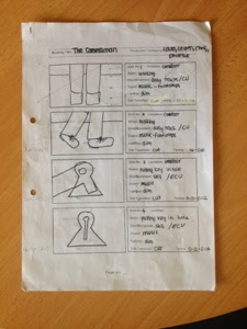
Storyboarding - our first draft
In Friday's lesson my group started story-boarding our idea out. We started to discuss appropriate shots, length of shots and what we wanted to convey on camera.
Our total time length came to about 1 minute 10 seconds; this created a problem as we realised that roughly, the length of the total opening sequence needed to be around 2 minutes 30 seconds. The storyboard is our first draft, so this has enabled us to be aware of specific things. My group now knows that the length of the opening sequence needs to be longer and we can solve this by adding more things and changing timings for certain frame shots.
We also discussed with my media teacher whether the title to the film 'The Camera Man' was appropriate. This was because we came up with a problem that the title could suggest that the 'Camera Man' was perhaps working for the police in a case for example because the idea is that we do not know who he is, however, we want to convey that he is an obsessed stalker but not know why he is. We discussed that the name 'camera' suggested a more 'investigating' representation, however, we came up with a title name of 'Video Camera'; this name suggests it's less professional and more stalker-ish because 'video-ing' someone is slightly odd and more perverse which is what we want to show.
Lastly we talked about a good soundtrack to go with the representation of this perverted, obsessed/OCD man. We thought a non-diegetic sound of piano keys in the background would suit the piece well as it could help set quite an uncomfortable, eerie tone. This sound would not be very involving meaning that it would not be loud and pacey, it would set a slow, waiting pace which supported the man's actions and his OCD.
 (Page 1)
 (Page 2)
 (Page 3)
 (Page 4)
 (Page 5)
Our total time length came to about 1 minute 10 seconds; this created a problem as we realised that roughly, the length of the total opening sequence needed to be around 2 minutes 30 seconds. The storyboard is our first draft, so this has enabled us to be aware of specific things. My group now knows that the length of the opening sequence needs to be longer and we can solve this by adding more things and changing timings for certain frame shots.
We also discussed with my media teacher whether the title to the film 'The Camera Man' was appropriate. This was because we came up with a problem that the title could suggest that the 'Camera Man' was perhaps working for the police in a case for example because the idea is that we do not know who he is, however, we want to convey that he is an obsessed stalker but not know why he is. We discussed that the name 'camera' suggested a more 'investigating' representation, however, we came up with a title name of 'Video Camera'; this name suggests it's less professional and more stalker-ish because 'video-ing' someone is slightly odd and more perverse which is what we want to show.
Lastly we talked about a good soundtrack to go with the representation of this perverted, obsessed/OCD man. We thought a non-diegetic sound of piano keys in the background would suit the piece well as it could help set quite an uncomfortable, eerie tone. This sound would not be very involving meaning that it would not be loud and pacey, it would set a slow, waiting pace which supported the man's actions and his OCD.
(Page 1) (Page 2) (Page 3) (Page 4) (Page 5)Friday, 1 November 2013
Our synopsis idea decision:
My group made a decision on what our final story idea was to be. We did go for 'The camera man' idea as we thought and planned what shots we wanted to do, use and what would work well. The setting/location could easily be done in the studio at my college, so this means we could focus a lot on what we want within the shot. We also covered that the idea was simplistic so that we could really put in effort in the work on screen rather than fussing over too complicated/busy story ideas.
Subscribe to:
Comments (Atom)